


Visual branding is the heartbeat of your brand identity. From the bold red of Coca-Cola to the unmistakable Tiffany blue, color plays a powerful role in how customers recognize and emotionally connect with your business. But achieving exact, repeatable color results across all your print materials isn’t easy, unless you're using Pantone ink printing.
At Bryant Graphics, we specialize in Pantone ink printing to ensure that your brand colors remain consistent across every format, from business cards to large-format signage. This gold-standard printing method delivers unmatched precision, elevating your professional print design and reinforcing your brand identity with every touchpoint.
In an age where brand consistency builds trust and loyalty, using the right color system is a strategic design decision. If you’re launching a new brand or scaling an established one, Pantone ink ensures your visuals are always on point, eliminating the inconsistencies that can arise with CMYK or digital-only workflows.
Read on to discover the important role of Pantone ink in corporate branding and why it's the smart choice for businesses that care about color.

Why Color Consistency Matters in Branding
Color is both decorative and strategic. Consistent print color enhances trust, builds familiarity, and helps create an emotional connection with customers. Studies in consumer psychology show that people make subconscious judgments about a product within 90 seconds, and up to 90% of that assessment is based on color alone.
Think of how we instantly associate the McDonald’s golden arches or UPS brown with their respective brands. That’s the power of branding consistency through color.
However, maintaining this consistency can be tricky, especially when materials are printed in different locations or with varying technologies. Without precise control, your rich navy blue could turn purple on one printer and greenish-gray on another. Color inconsistency leads to brand dilution, undermining all the hard work invested in building recognition.
What Is Pantone Ink Printing?
Pantone ink printing is a high-fidelity printing method that uses standardized, pre-mixed ink colors from the Pantone Matching System (PMS). Unlike CMYK, which builds color from percentages of cyan, magenta, yellow, and black, Pantone inks are made with specific pigment formulas, ensuring exact color printing every time.
What Is the Pantone Matching System (PMS)?
Unlike process color, which blends cyan, magenta, yellow, and black to approximate shades, Pantone vs process color offers unparalleled fidelity through solid spot inks. The PMS is a universally recognized color matching system that uses swatch guides, like the Pantone Formula Guide, to ensure consistent reproduction of colors across designers, printers, and materials.
- Spot color printing: Uses single, pre-mixed ink colors (Pantone).
- Process color printing: Mixes CMYK inks to simulate a broad range of colors.
Pantone colors are global color standards. What you see in your design file is what you'll get in print, no matter where or how you print it.
Pantone vs. CMYK – What’s the Difference?
Designers may sometimes need to convert Pantone to CMYK for printing, but this conversion can result in slight color shifts that compromise brand consistency. So, when it comes to printing Pantone vs CMYK, the key difference lies in color precision. Pantone offers exact, pre-mixed hues, while CMYK blends four inks and may struggle to replicate specific brand colors.
Here’s a quick comparison:
|
Feature |
Pantone (Spot Color) |
CMYK (Process Color) |
|
Color Accuracy |
Extremely precise |
Can vary between printers |
|
Color Range |
Limited but vibrant |
Wider gamut but less control |
|
Best For |
Logos, brand colors, packaging |
Full-color photos, gradients |
|
Global Consistency |
Yes |
Not guaranteed |
|
Special Effects |
Metallics, neons, fluorescents |
Limited or unavailable |
Understanding Pantone vs. process color helps designers and businesses choose the best method for maintaining brand integrity.

How Pantone Ink Ensures Precise Color Matching
With Pantone ink printing, there is no guesswork. Each color is mixed using exact pigment formulations, removing uncertainty from the graphic design color systems process.
- Your red stays red, from brochures to banners.
- Difficult hues like neons, metallics, and deep purples are reliably produced.
- Results are consistent across coated, uncoated, and specialty paper stocks.
This level of control is what makes Pantone printing ideal for corporate materials where logo color accuracy and brand presentation matter most.
Best Uses for Pantone Ink in Business Printing
Certain projects, such as luxury invitations or business stationery, benefit from the tactile richness of letterpress, making this a key distinction in letterpress vs. digital printing approaches. For projects that demand a tactile, timeless finish, Bryant Graphics offers expert letterpress printing, perfect for business cards, invitations, and branded stationery.
Logos & Brand Marks
Logos are the cornerstone of any brand. Reproducing them accurately across different formats is crucial. Pantone printing ensures that your logo looks the same on everything from brochures to letterpress printing to trade show signage.
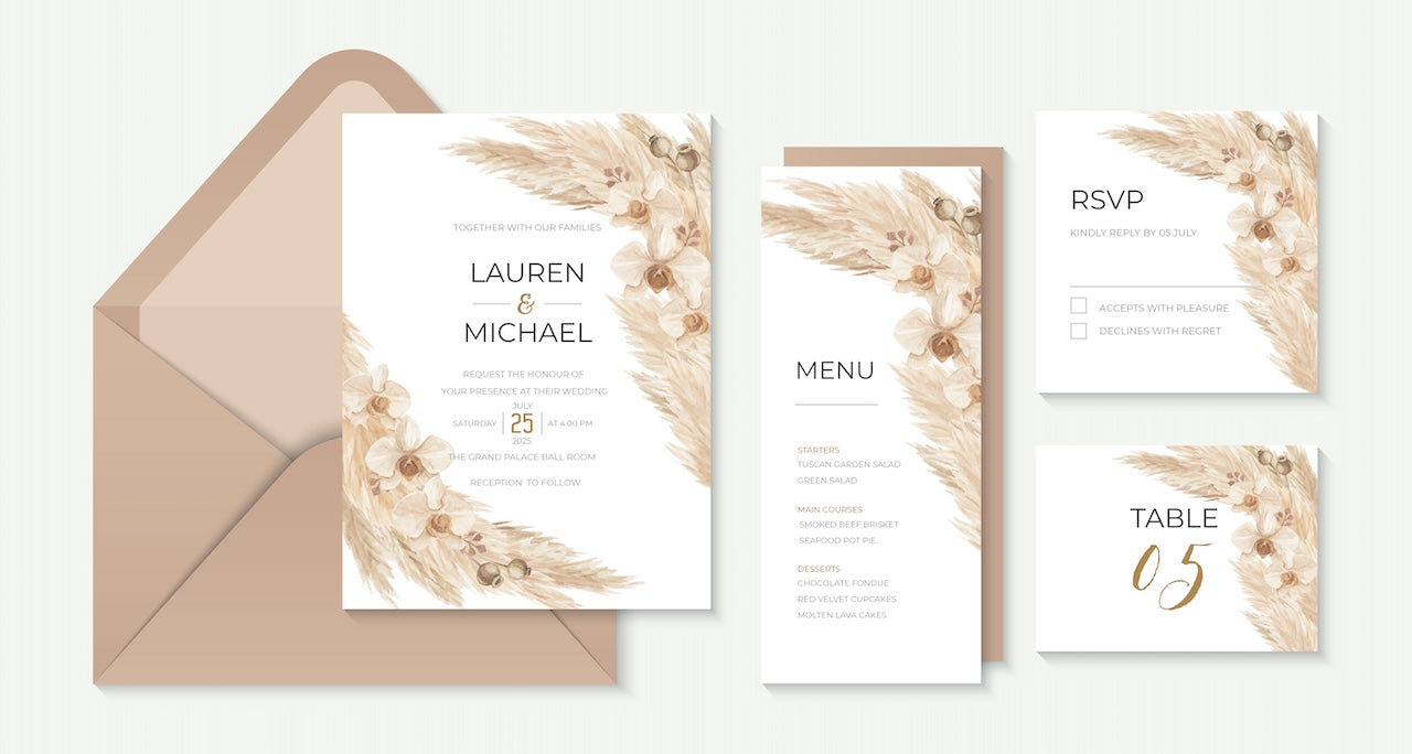
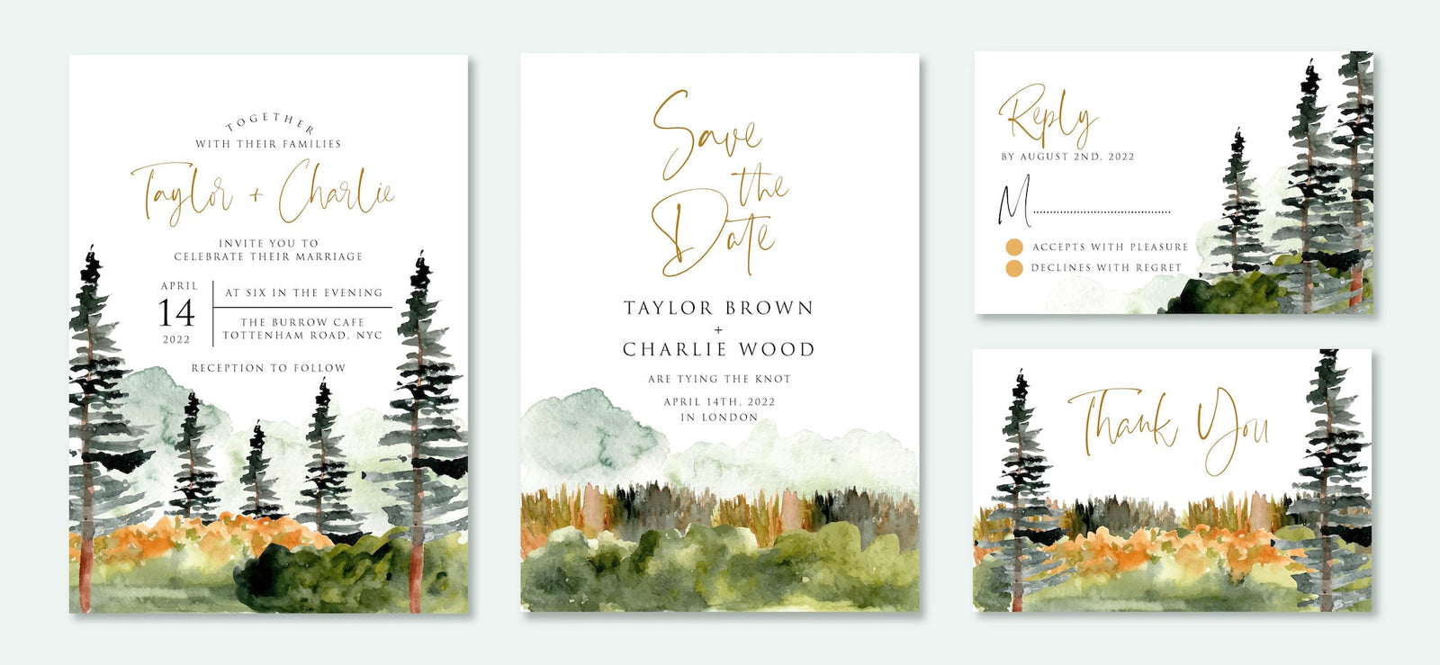
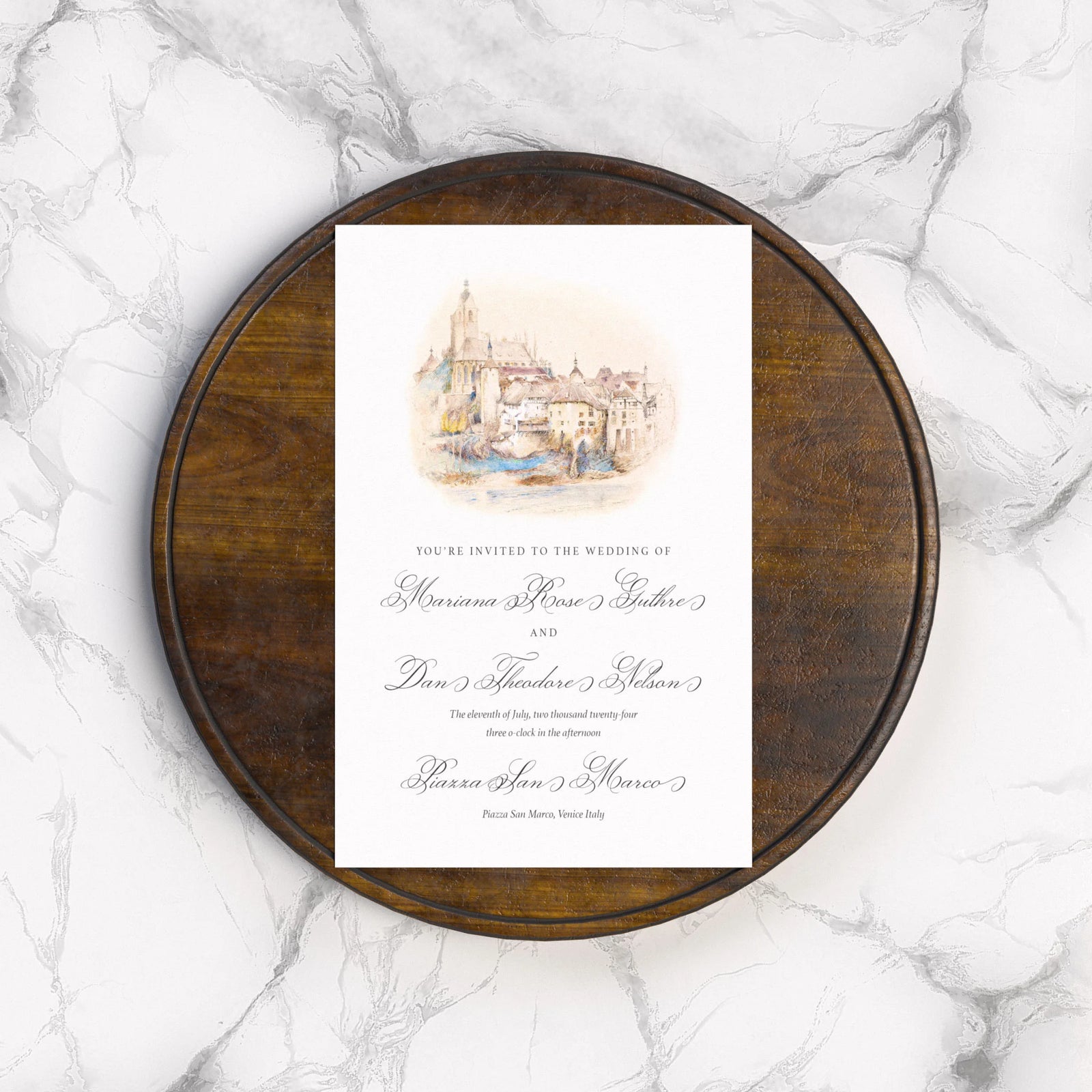
Business Cards, Stationery & Packaging
Subtle differences in shade on a business card can signal inconsistency. For professional print design that enhances trust and quality, Pantone ink delivers. Explore our business stationery options.
Event Materials & Trade Show Displays
For large-format materials, even small shifts in color can be glaring. Pantone color matching keeps your banners, tablecloths, and displays unified, enhancing your booth's professional appearance.
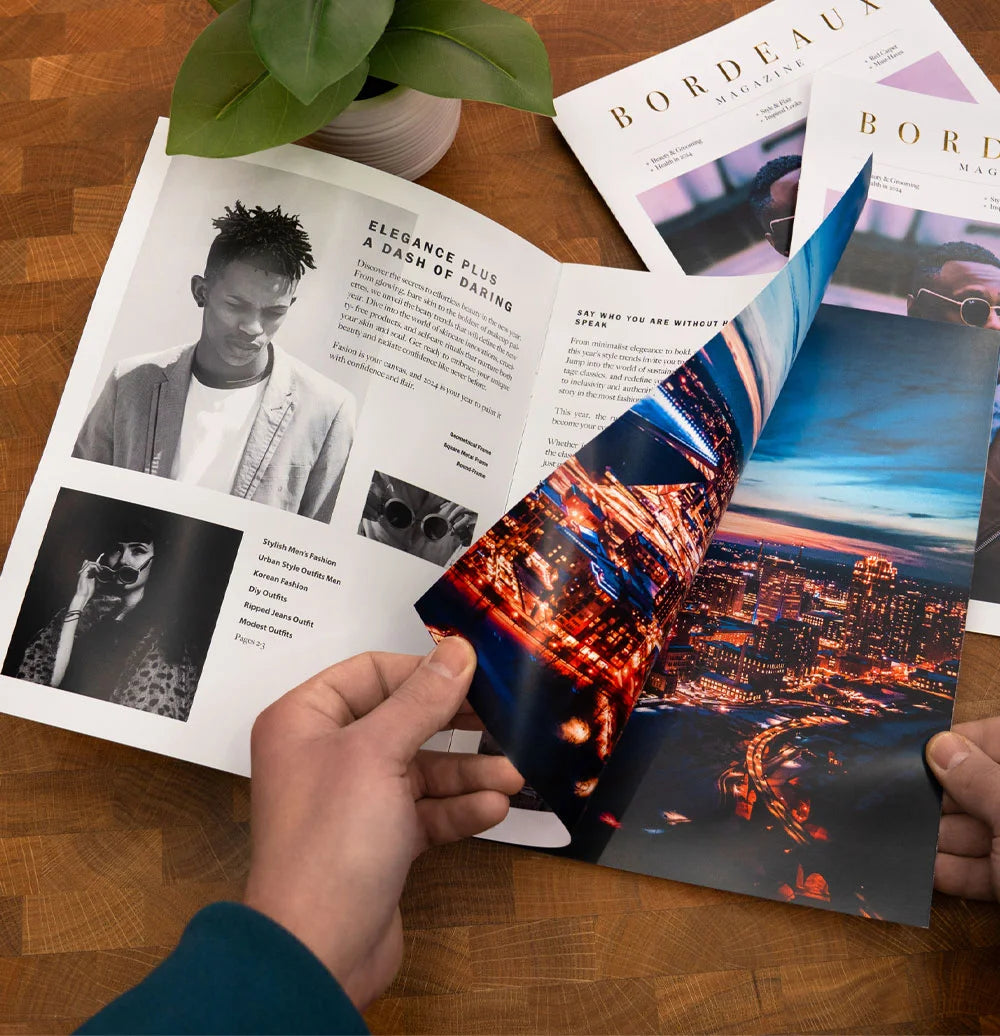
Premium Marketing Materials
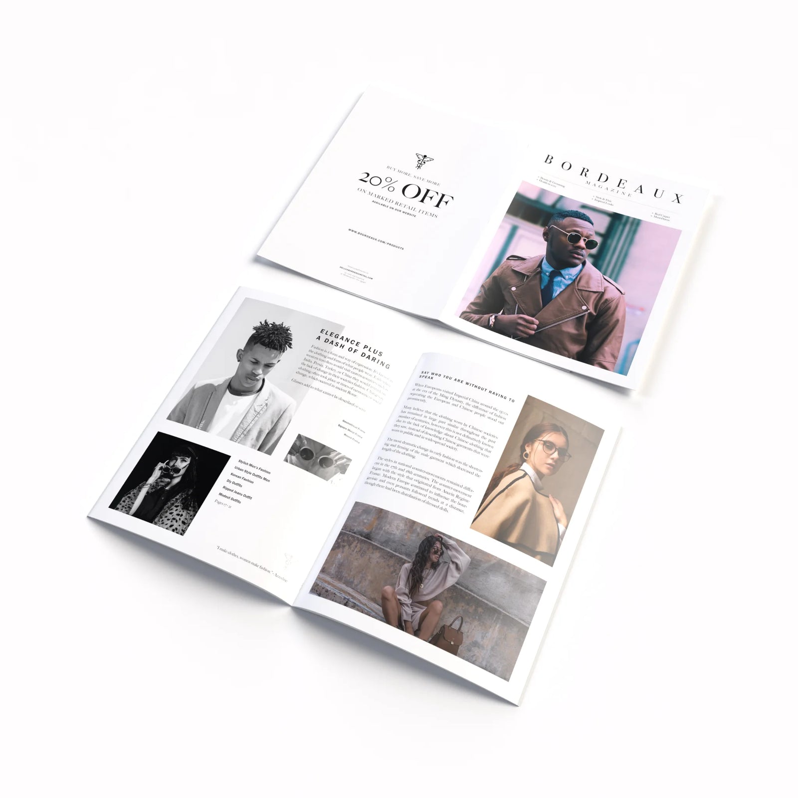
When creating high-end mailers, annual reports, or product catalogs, appearance is everything. Pantone ink gives your materials the premium, polished finish your audience expects. To emphasize your brand presence even further, consider foil printing options, which pair beautifully with Pantone ink for high-end packaging and marketing materials. View our sales and marketing materials to see some specific examples.
Pantone for Designers: How to Design with Pantone in Mind
If you're a graphic designer, incorporating Pantone branding from the start can simplify the Pantone printing process down the line. Here’s how:
- Use Pantone swatches in Adobe Illustrator or InDesign.
- Choose colors from the Pantone Solid Coated or Uncoated guides depending on your paper stock.
- Communicate clearly with your printer: provide Pantone values for each element.
- Consider how materials will be printed, whether via offset, letterpress, or foil printing.
At Bryant Graphics, we support design teams with expert guidance on selecting and using custom ink colors for brand accuracy.
Pantone Ink Printing at Bryant Graphics
As a trusted partner in professional printing, Bryant Graphics offers comprehensive Pantone ink printing services to help businesses maintain branding consistency across all formats.
- In-house Pantone matching and proofing: See your exact color before we go to press.
- Custom ink mixing and spot color control: Tailored solutions to meet your brand needs.
- Sustainable options: Ask about our eco-conscious Pantone ink formulations.
- Consultation services: Get expert advice on implementing consistent branding across your printed assets.
Whether you're launching a new brand or refining an existing one, our team ensures that every piece, from offset printing to letterpress, reflects your brand with absolute precision.

Why Pantone Ink Is Worth the Investment
Choosing Pantone ink printing is about looks and maintaining a powerful, professional identity across every printed asset. While CMYK might be sufficient for everyday marketing materials, when it comes to preserving your brand’s integrity, PMS color printing is worth every penny. Pantone ink benefits include consistent brand representation, precise reproduction across print jobs, and access to specialty colors like metallics and fluorescents.
At Bryant Graphics, we believe that color should never be left to chance. We invite businesses to audit their current printed materials and ask: Are your colors consistent? Does your print reflect the quality of your brand? If not, now is the time to invest in exact color printing and high-fidelity, brand-focused design with Pantone inks.
Ready to experience the benefits of Pantone ink printing? Connect with Bryant Graphics to explore our full range of professional printing services, from business stationery to premium marketing materials, and even our Pantone printing services.